Re-Branding of Design House
ClientDesign House Advertisement Production
IndustryAdvertisement and Marketing
Year2016
My RoleBrand Development
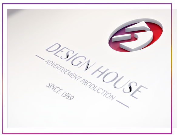
Brief Design House is an Advertising Agency based in Dubai since 1989. The brief was to make a New, Fresh identity which is modern and attractive at the same time. The Purpose of having a new identity was to re-position Design House in the market and get the bigger clients. They were using a 27 years old logo and that was never changed. They had the icon of D&H composed in a particular way which they wanted to keep as clients remember them with that identity.
The Concept
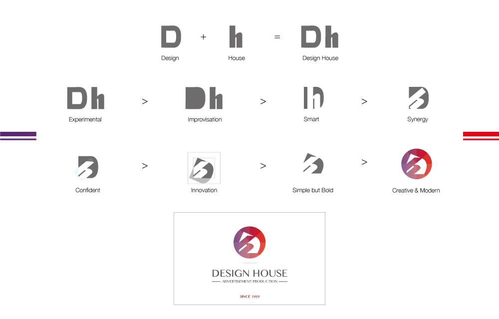
The Brand Mark is derived by abstracting letter forms of D & H. The Brand icon enjoys its unique identity since 1989 and I decided to keep this existing identity to ensure a sense of Brand familiarity but with more bold, modern, unique, fluid and versatile look. I introduced the round colorful element that helped in achieving the fluidity and represents limitless possibilities. This also gives the concept that Design House is a 360° Interactive Advertising and Marketing Agency. The color scheme is modern, brisk and vibrant which gives the identity mark a very fresh and modern look.
The DH Interlock serves as a visual mark that can be used to represent the values of Design House which are Experimental, Communicative, Smart, Bold, Creative, Simple, Innovative and Nature-friendly. This particular visual mark will be used most prominently on the various brand collaterals and merchandise.
The inception year 1989 of Design House will be part of the identity, indicating how old Design House is in the market. This is something Design House can leverage on in the market. Good selling point.
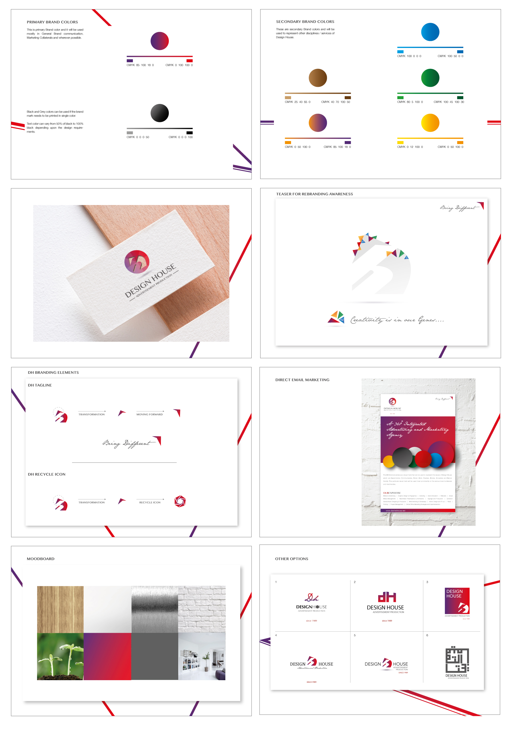
The color palette was borrowed from nature with versatility in colors. Black and white are often used against each other, with black denoting mystery and sophistication, and white claiming cleanliness and purity. But when combined, they create balance. Considering the emotional value and meaning behind a color can do wonders for the brand. We used simple colors, and the impact of a strong and consistent history will help to make the brand memorable.
The Brand Mark Evolution
Project Deliverables
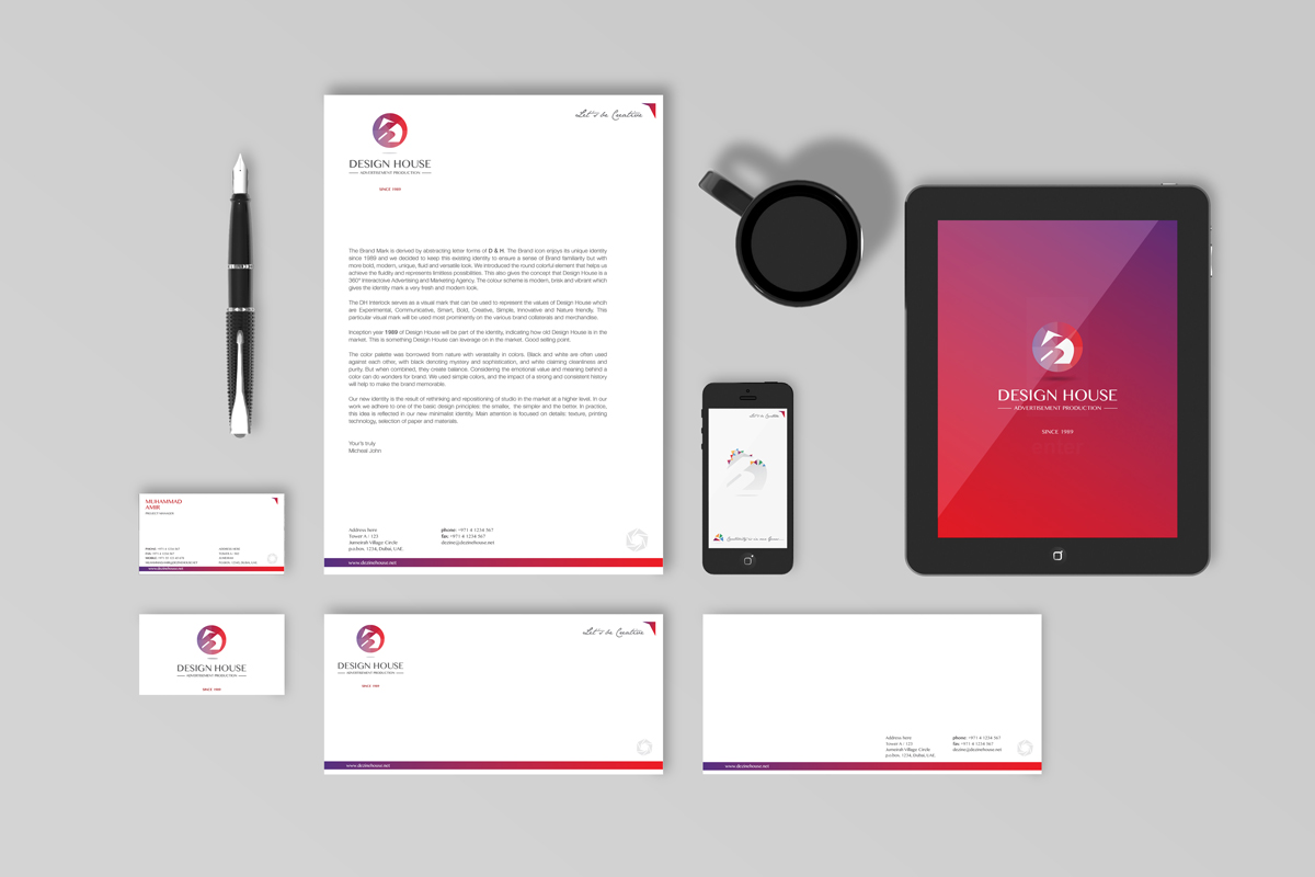
Project Deliverables • New Identity • Brand Guidelines • Stationery Collaterals • Branding • Office Interior • Marketing Collaterals • New Website • Marketing Strategy • Social Media Content
View more Creative Work
Full Circle Brochure
Full Circle Brochure Design
Vida Clinic Interior
This project is about Brand development, Marketing Collaterals and Interior Design of Vida Clinics.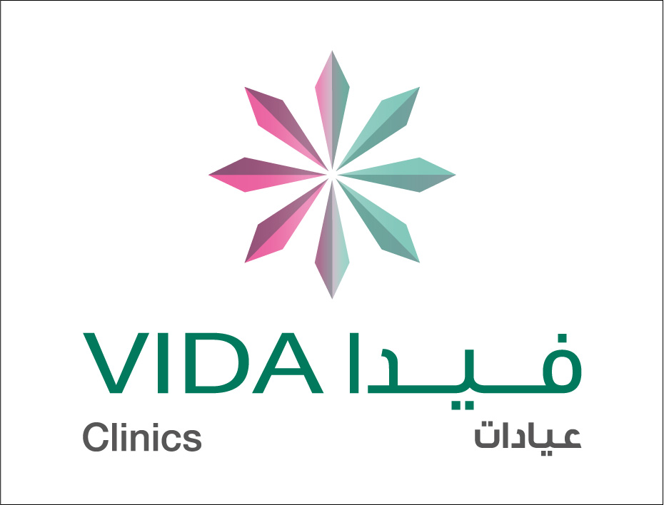
Packaging & Labelling
Packaging & Labelling Design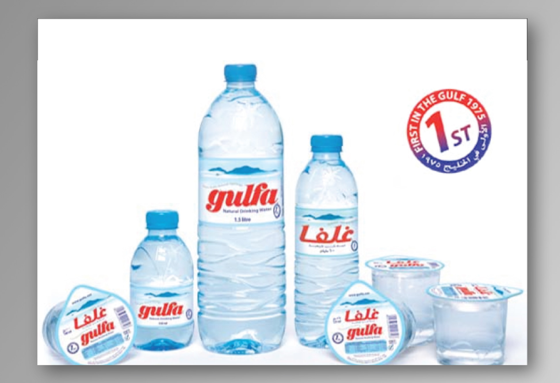
Phoenix Middle East Brochure
Phoenix Middle East Brochure Design.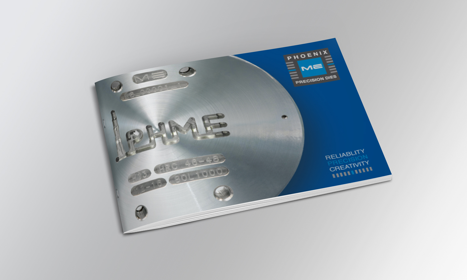